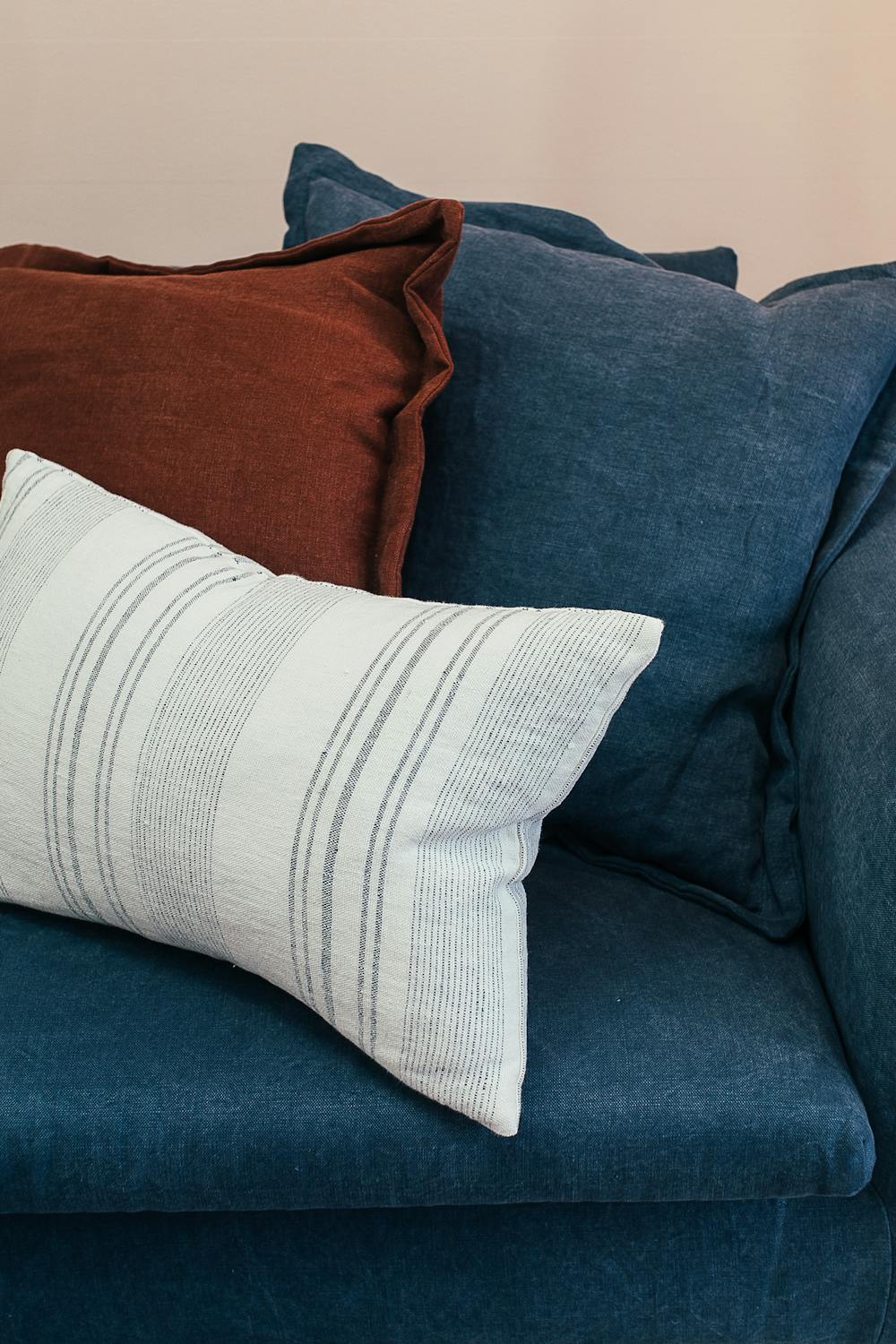
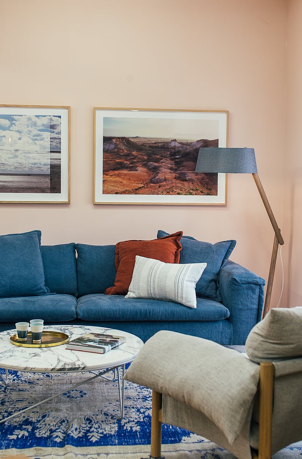
In the realm of interior design, color plays a pivotal role in setting the mood, creating harmony, and enhancing the aesthetic appeal of a space. Among the myriad principles that guide interior designers, the “3-Color Rule” stands out as a fundamental concept. In this comprehensive guide, we delve into the essence of the 3-Color Rule, its significance, practical applications, and tips for implementation.
Table of Contents
ToggleWhat is the 3-Color Rule?
The 3-Color Rule, also known as the “Rule of Three,” is a principle in interior design that suggests using three colors in a space to achieve balance, cohesion, and visual interest. This rule applies to various elements within a room, including walls, furniture, accessories, and accents.


Significance of the 3-Color Rule:
1. Balance:
By incorporating three colors, designers can strike a balance between different hues, tones, and shades, preventing the space from appearing too monotonous or overwhelming.
2. Cohesion:
The use of a limited color palette fosters cohesion and unity throughout the room, creating a sense of harmony and continuity.
3. Visual Interest:
Three colors allow for a dynamic interplay of contrasts and highlights, adding depth and visual interest to the design scheme.

Practical applications of the 3-Color Rule:
1. Primary, Secondary, and Accent Colors:
Designate one color as the primary hue, another as the secondary hue, and the third as an accent color. The primary color dominates the space, the secondary color complements it, and the accent color adds pops of visual interest.
2. Color Proportions:
Distribute the three colors proportionally throughout the room to maintain balance. Aim for a ratio of 60-30-10, with the primary color occupying 60% of the space, the secondary color 30%, and the accent color 10%.
3. Tone and Texture:
Experiment with different tones and textures within each color to add depth and dimension. For instance, combine matte and glossy finishes or incorporate textured fabrics to enhance visual appeal.
4. Consider the 60-30-10 Rule:
This rule is a derivative of the 3-Color Rule and provides a precise guideline for allocating colors in a space. It ensures a harmonious balance while allowing for creative flexibility.

Tips for Implementing the 3-Color Rule:
1. Start with a Neutral Base:
Begin with a neutral base color, such as white, beige, or gray, as it provides a versatile backdrop for introducing accent colors.
2. Choose a Color Scheme:
Select a color scheme that reflects your personal style and complements the mood and function of the space. Common schemes include monochromatic, analogous, complementary, and triadic.
3. Experiment with Color Samples:
Test various color combinations using paint samples or fabric swatches to visualize how they interact in different lighting conditions.
4. Embrace Contrast:
Incorporate contrast by pairing light and dark hues or warm and cool tones to create visual impact and focal points.
5. Use Color Psychology:
Consider the psychological effects of colors when designing a space. For example, blue promotes tranquility, while red evokes energy and passion.
6. Edit and Refine:
Edit your color palette as needed to achieve the desired balance and harmony. Eliminate excess colors that disrupt the cohesion of the design.

The 3-Color Rule serves as a guiding principle for achieving balance, cohesion, and visual interest in interior design. By strategically incorporating three colors into a space, designers can create harmonious environments that resonate with occupants and evoke desired emotions. Whether applied through primary, secondary, and accent colors or adhering to the 60-30-10 rule, mastering this principle empowers designers to unleash their creativity while maintaining a sense of order and unity. Embrace the versatility of color and let the 3 Color Rule be your compass in the journey of crafting beautiful and functional interiors.
If you enjoyed this article, share it with your friends and colleagues!
- you might be interested in reading this post as well
- The Power of Color: How to Use it in Interior Design

Pingback: How to create a small space functional and stylish